
If you're learning cursive handwriting or helping someone else learn, the letter "f" might feel like a tricky puzzle. It’s not always the easiest to shape, especially in its lowercase form. But with the right tools, a bit of patience, and some fun practice, you can get it just right. Whether you're a teacher, a parent, or someone brushing up on your handwriting skills, this guide will walk you through everything you need to know about writing the cursive f with confidence.
Writing in cursive isn’t just about making your handwriting look elegant. It helps build muscle memory, improves fine motor skills, and even boosts brain development. The lowercase cursive f, in particular, is a great example of how practice makes progress. It’s one of those letters that tends to trip people up, especially when it comes to connecting it with other letters or keeping the loops consistent.
The good news? There are plenty of free resources out there, including printable worksheets, animated guides, and even digital apps that help you learn at your own pace. Whether you're just starting out or want to refine your style, this post will break it all down in a friendly, easy-to-follow way. So, let’s get started!
Table of Contents
- What Is the Cursive F and Why Is It Important?
- How to Write the Cursive F (Uppercase and Lowercase)
- Best Resources to Practice Writing the Cursive F
- Common Mistakes and How to Fix Them
- Frequently Asked Questions
What Is the Cursive F and Why Is It Important?
The letter “f” in cursive is a bit of a standout. It looks quite different from its printed form, especially the lowercase version. In most cursive styles, like the D’Nealian method—which is widely taught in U.S. schools—the lowercase f has a tall loop that rises above the line, making it one of the more distinctive letters in the alphabet.
It’s not just about looks, though. Learning to write the cursive f well helps with overall fluency in writing. It also plays a big role in learning how to connect letters smoothly, especially with other letters that have ascenders or descenders like “b,” “d,” “g,” or “p.”
Many students find the lowercase f challenging because of the loop and the way it connects to other letters. But once you get the hang of it, it becomes a lot easier and actually feels pretty satisfying to write. So, if you're just starting out, don’t worry—it gets better with practice!
How to Write the Cursive F (Uppercase and Lowercase)
Writing the Uppercase Cursive F
Let’s start with the uppercase “F.” It’s usually simpler than the lowercase version and a good place to build confidence. Here’s how to do it:
- Begin at the top line. Draw a straight vertical line downward.
- Without lifting your pen, make a horizontal line that goes to the right from about halfway down the vertical stroke.
- Add a short, curved hook at the bottom of the vertical line, looping it slightly to the right.
This version looks clean and structured. It’s pretty similar to the printed “F,” just with a little cursive flair at the bottom.
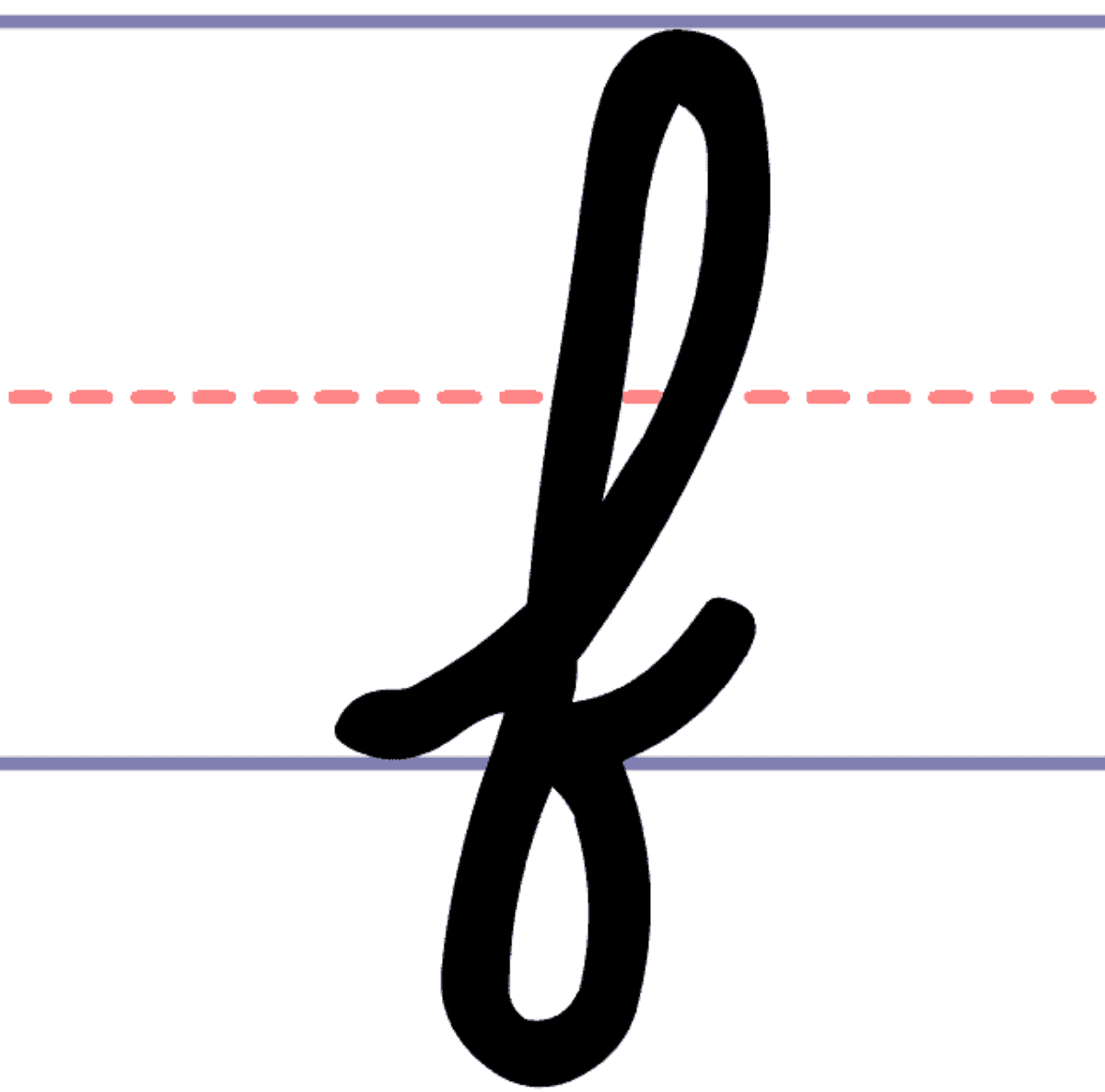
Writing the Lowercase Cursive F
The lowercase cursive f is where things get a bit more fun—and a little trickier. Here’s a step-by-step breakdown:
- Start just above the middle line and draw a loop that goes up, then curves back down, crossing the middle line.
- Continue with a straight line downward, stopping just below the baseline.
- Finish with a small horizontal line to the right at the bottom of the vertical stroke.
It might take a few tries to get the loop just right. The key is to keep your strokes smooth and consistent. You can always use tracing worksheets to help train your hand movements.
Best Resources to Practice Writing the Cursive F
There are so many helpful tools out there to make learning the cursive f easier and more fun. Whether you're a visual learner or prefer hands-on practice, here are some top picks:
- Free Cursive F Worksheets: These let you trace the letter over and over, which is perfect for building muscle memory.
- Animated GIFs: Watching a short video of the letter being written helps you understand the flow and direction of each stroke.
- Cursive Writing Apps: There are a number of educational apps that offer interactive lessons and games to make practice feel more like play.
- Printable Charts: These charts show both uppercase and lowercase versions of the letter, along with tips for stroke order.
One of the best parts about these resources is that they’re usually free and easy to find online. You can print out worksheets and use them again and again, or try a new app for a fresh learning experience.
Learn more about cursive writing tools that can help students at every stage.
Common Mistakes and How to Fix Them
Even with all the tools and tips, it’s normal to run into a few hiccups. Here are some of the most common mistakes when learning the cursive f and how to fix them:
Messy Loops
So many learners struggle with the loop on the lowercase f. If yours looks more like a scribble than a smooth curve, take it slow. Use tracing paper or a worksheet to get a feel for the shape before going freehand.
Uneven Lines
If your vertical stroke leans to one side or isn’t straight, it might be because of how you’re holding your pencil or the angle of your paper. Try adjusting your grip or tilting your paper slightly for a more comfortable writing position.
Connecting Letters Poorly
The lowercase f is often tricky to connect with other letters. One trick is to practice writing it in short words like “if” or “of.” That way, you can get used to how it flows with letters before moving on to more complex words.
Frequently Asked Questions
Can I use LaTeX to write a fancy cursive F?
Yes, you can use the \mathcal{f} command in LaTeX to create a stylized version of the letter. However, some users prefer a fancier look and may use additional packages like mathtime for more elegant formatting.
What if I want to write the letter f without the crossbar in cursive?
Removing the crossbar is not standard in most cursive styles, but some people do it for stylistic reasons. You can simply draw the loop and vertical stroke without adding the short horizontal line at the top. Keep in mind this might make the letter look like a lowercase “l” to some readers.
How can I make my cursive F look fancier or more elegant?
To make your cursive f look more elegant, practice writing with smooth, flowing strokes. Focus on keeping the loop consistent and the vertical line straight. You can also experiment with different cursive fonts or styles to find one that feels right to you.
Learn more about different cursive styles and how to choose one that suits your handwriting.
![Cursive F [Letter F Worksheet + Tutorial]](https://mycursive.com/wp-content/uploads/2020/01/f.jpg)
Detail Author:
- Name : Jeffry Bayer
- Username : nannie.hegmann
- Email : iyost@hill.com
- Birthdate : 1977-04-27
- Address : 92454 Eliane Pine Lake Holdenburgh, NM 32067-7769
- Phone : +1.207.541.6836
- Company : Fay and Sons
- Job : Home Health Aide
- Bio : Nisi labore est vel. Provident voluptas et fuga consequatur.
Socials
linkedin:
- url : https://linkedin.com/in/jodie3997
- username : jodie3997
- bio : Quaerat voluptatibus voluptate eum dolor aut.
- followers : 4592
- following : 579
twitter:
- url : https://twitter.com/jodie5248
- username : jodie5248
- bio : Eum nobis nesciunt dolorem consequatur. Consequuntur ducimus earum in impedit sed. Adipisci nulla vel asperiores enim nisi nisi.
- followers : 1894
- following : 2744
